Update 3
First Quarter Recap
In the FLIR group we’ve been working on a real time object detection model with the primary goal of observing the effects of added noise and adversarial attacks on the models accuracy. Much of our first quarter was spent researching the subject matter, getting familiar with the neccesary tools needed to complete the project, and setting up an environment to work under. By the end of the quarter we had a Yolo v5 model (Model we used for reference(https://github.com/ultralytics/yolov5)) trained on the entire FLIR dataset (https://www.flir.com/oem/adas/adas-dataset-form/) and achieved solid metrics to use as a baseline to test against later. We then started to plan out the experiments we hoped to run and devloped a framework to complete it.
Progress this quarter
Our first step was to create a pipeline that we could use to add noise to each image in the dataset and observe the effect it had in our model. Below is a block diagram to vizualize what this pipeline looks like.
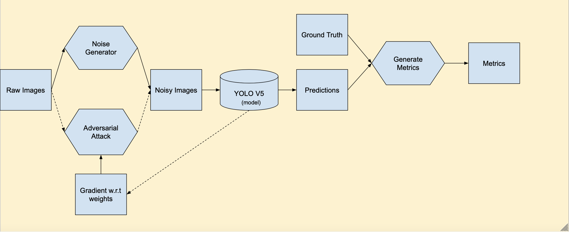
Fig. 43 Pipeline Block Diagram
In this diagram rectangles represent data, hexagons represent processes, and the cylinder represents our model. Before the pipeline we were able to add noise individually to the image and test it on the model but in order observe the effects on the whole dataset we needed a more streamlined process. Esentially we take our raw images and generate noise on the fly before passing them into our model. The model will generate predictions and from there we gather metrics on the accuracy after noise was added and compare to our baseline. We also included the pipeline for adversarial attacks represented by the dashed lines. In this case there is a feedback loop between the model as the attack is updated based on the gradient with respect to the model weights.
Now that we’ve created this pipeline we’re ready to test different types of noise on the whole dataset. Below are examples of different types of noise we plan to experiment with.
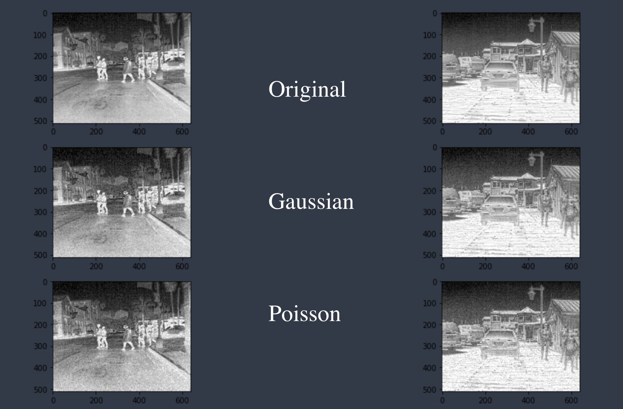
Fig. 44 Example Noise
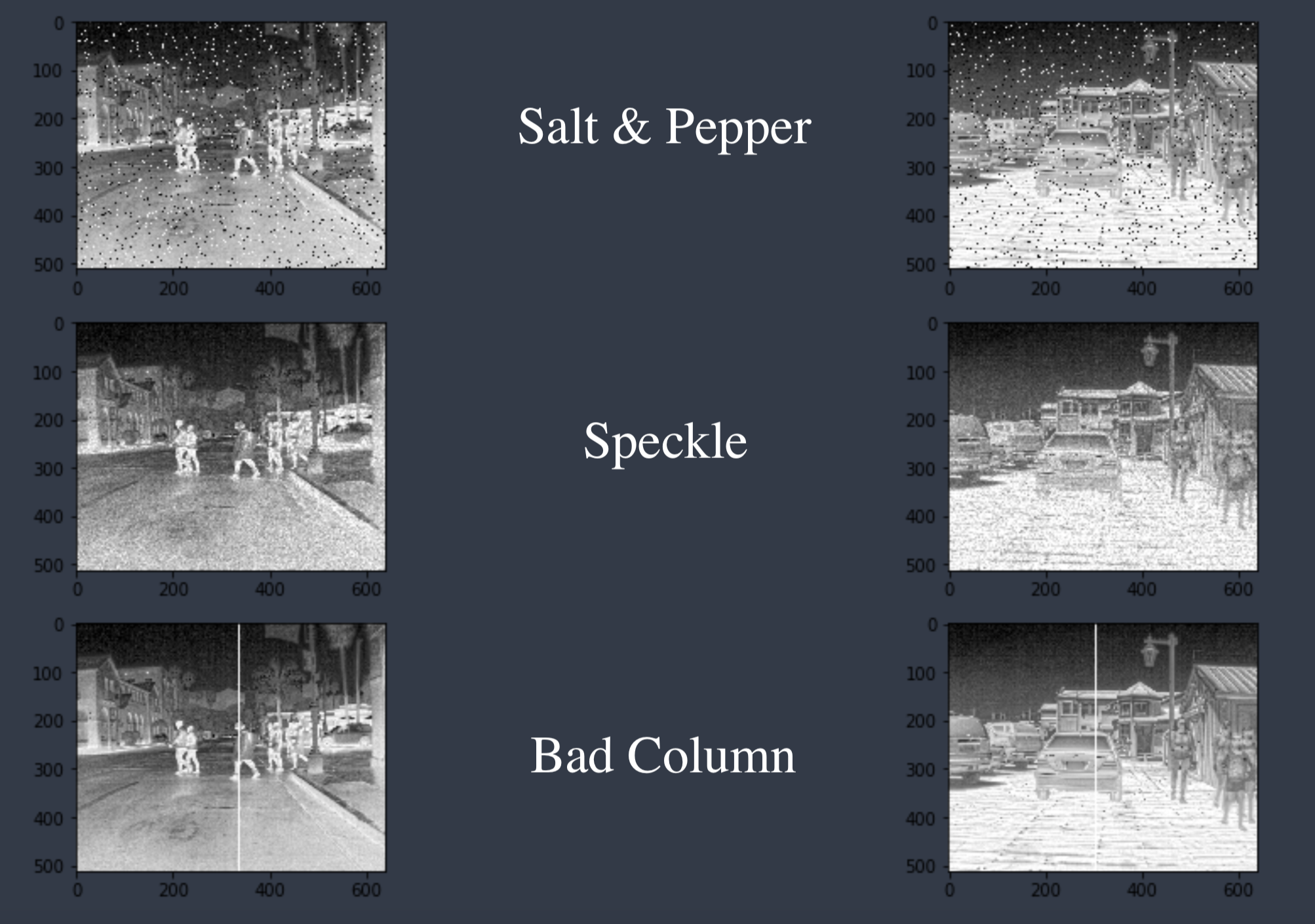
Fig. 45 Example Noise
Pictured above are two original images from the dataset and those images after five different types of noise were added. Gaussian noise adds values generated from a normal distribution. Poisson noise uses the image pixels as the mean for a poisson process and this generates a noise mask that is added to the image. Salt & Pepper noise takes really low and really high pixel values and changes them to black and white pixels respectively. Speckle noise is multiplicative process that multiplies the image pixels by values from normal distribution and these values are added back to the image. The bad column noise represents a real world issue with infrared in which an entire column goes bad. This was generated by changing a randomly selected column values all to one.
Initial Tests
Going further we needed to find a way to compare different types of noise. Considering that each type of noise will degrade the images at different levels we can’t just do a one to one comparison of model accuracy. We’re using an epsilon value to scale the amount of noise from each distribution and calculate the average L2 norm(the square root of the sum of squared pixel values) between the noisy and original images across the whole dataset. Using different target L2 norm values we aim to degrade the image quality equal amounts between different distributions. We utilized a bisection search to find the epsilon value for each distribution that hits our target L2 value. Below are different plots after we’ve added uniform, gaussian, poisson, and speckle noise. The x-axis represents the L2 norm difference between the noisy image and the original and the y-axis represents the corresponding mAP score that our model recorded. An L2 value of 0 represents our baseline score with no noise added and as we can see as we increase the amount of noise the model performace decreases significantly. Of the three different distributions tested gaussian was the most adversarial and poisson was the least.
To vizualize what different L2 norm values look like here are a few examples using one of the example images above with varying levels of added noise and their corresponding L2 value.
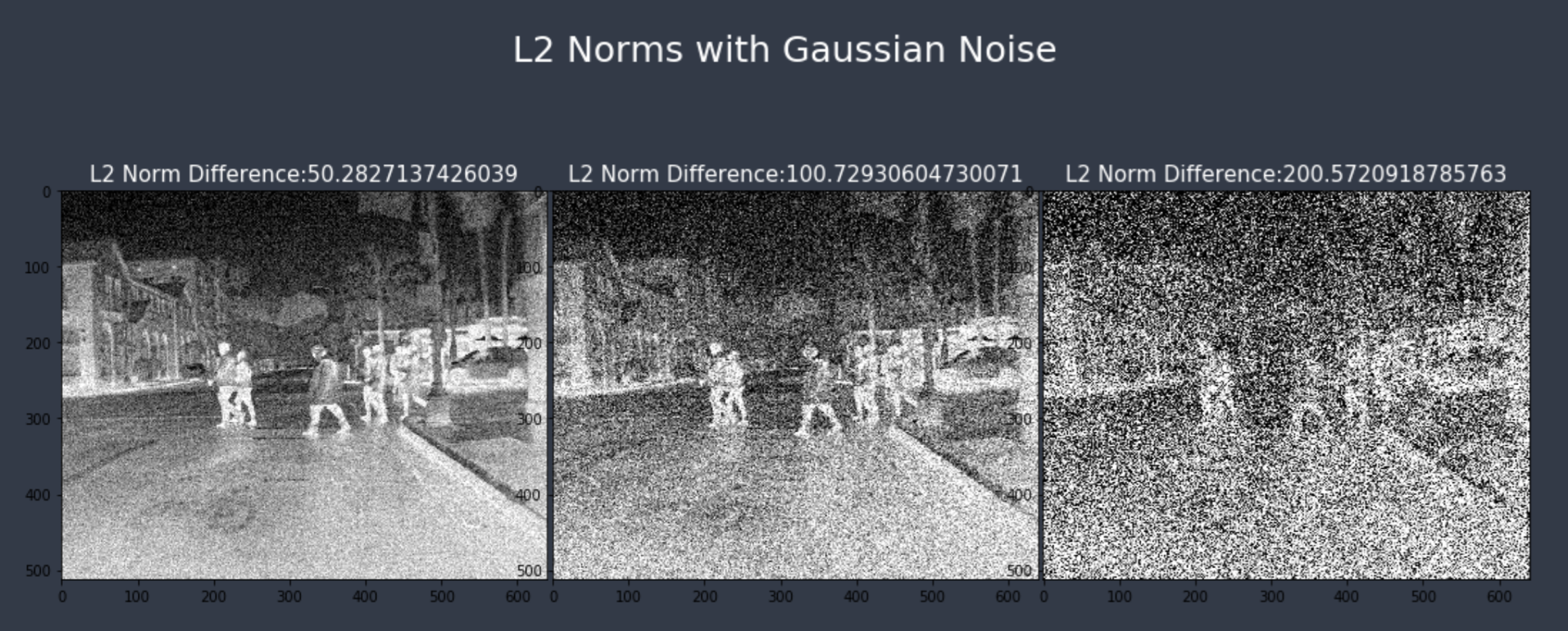
Fig. 46 L2 Example
Next steps
Now that we’ve reached a major milestone of generating noise that degrades our model performance we’re able to analyze the effect different levels of noise will have. We plan to continue experimenting with more distributions of noise as we aim to mimick noise that would occur in a real life scenarios in thermal imaging. Beyond that we still hope to look for solutions to make our model more robust against these attacks and plan to continue training on augmented datasets.