Update 1
Overview
For the first half of this winter quarter, we focused on doing exploratory analysis on our Global Biotic Interactions (GloBI) dataset. This dataset contains information on interactions between bees and plants. Each row represents an interaction, and the data comes from museum records, publications, and from people submitting their sightings/observations to be recorded online. There are columns detailing the taxonomy of the bees and the plants, like what family, genus, or species they belong to. There is also a column detailing what is the source of this sighting, which is the citation.
Our goal is to understand interactions between bees and flowers, like which types of bees visit which types of flowers and why. To accomplish this, we made network graphs and heatmaps with various R and Python packages like igraph, bipartite, NetworkX, Plotly, ggraph, and ggplot.
Progress
Week 1
We spent the first week learning about our research interest (bees) and exploring the Global Biotic Interactions (GloBI) dataset. Our data come from literature reports, human observations, and natural history specimen. Goal of GloBI is to structure data into a usable form (csv., tsv.).
During our weekly meeting with the sponsors, we gained substantial knowledge about bees, especially the vital role it plays in global biotic interactions. In particular, we want to focus our research on the interactions between bees and plants. Interactions are directional, i.e. “Apis Mellifera pollinates brasicca rapa” will be categorized into source, interaction, and target, respectively.
The goal for this week is to get a sense of the strengths and liminations of differnt query methods. Our options are direct access to the data files, rglobi package, GloBI Web API, and Cypher on Neo4j. We discovered that these methods operate on the same dataset, which renders the same result regardless which one we use.
Week 2
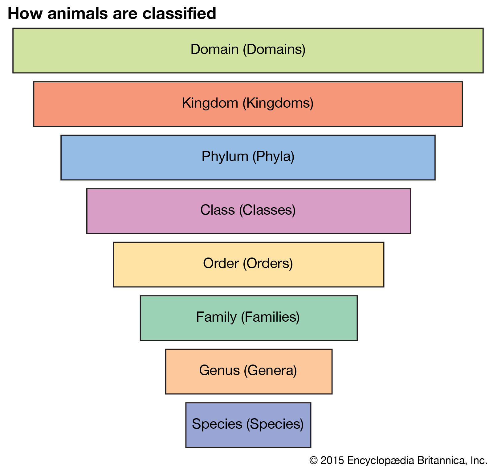
During our meeting for week 2, we went over the 8 levels of taxonomy, which is shown below. We also learned about the 7 bee families. For instance, the honey bee belongs to Apidae, the largest bee family.

Then, we discussed our results from using rglobi, the GloBI Web API, and Cypher. Each querying method has its own pros and cons. For example, rglobi was easy to use, but it didn’t seem to have complete information in all of its columns. Cypher had a big learning curve, so we chose to not use that method. In the end, we decided it was better to use the raw csv file, which was 15 GB, for completeness.
The goals after this meeting were to take some time to explore the raw dataset, since it was huge, check for reflexiveness in the data, and begin thinking about how we want to visualize these pollination networks. Additionally, we needed to brainstorm how to work with large data files that need to be shared and updated periodically. Some of us chose to explore the dataset with R while others were more comfortable with Python.
Week 3
We discussed the attributes and qualities of the raw data. Also, we explored different options for querying and subsetting the data in more detail. Our sponsors provided more insight on variations in the interactions data. Some of this variation includes: size, coloration, foraging behavior, and sociality of bees. There is significant diversity in the Apidae bee family. Classification and taxonomy can be used to filter some of this variation.
Another topic for consideration was visualization. We learned of different methods to visualize network data. Some of our options included igraph & bipartite for R packages; NetworkX, Plotly, Dash for Python packages. By visualizing this data, we would gain more insight on the network structure and attributes of the data.
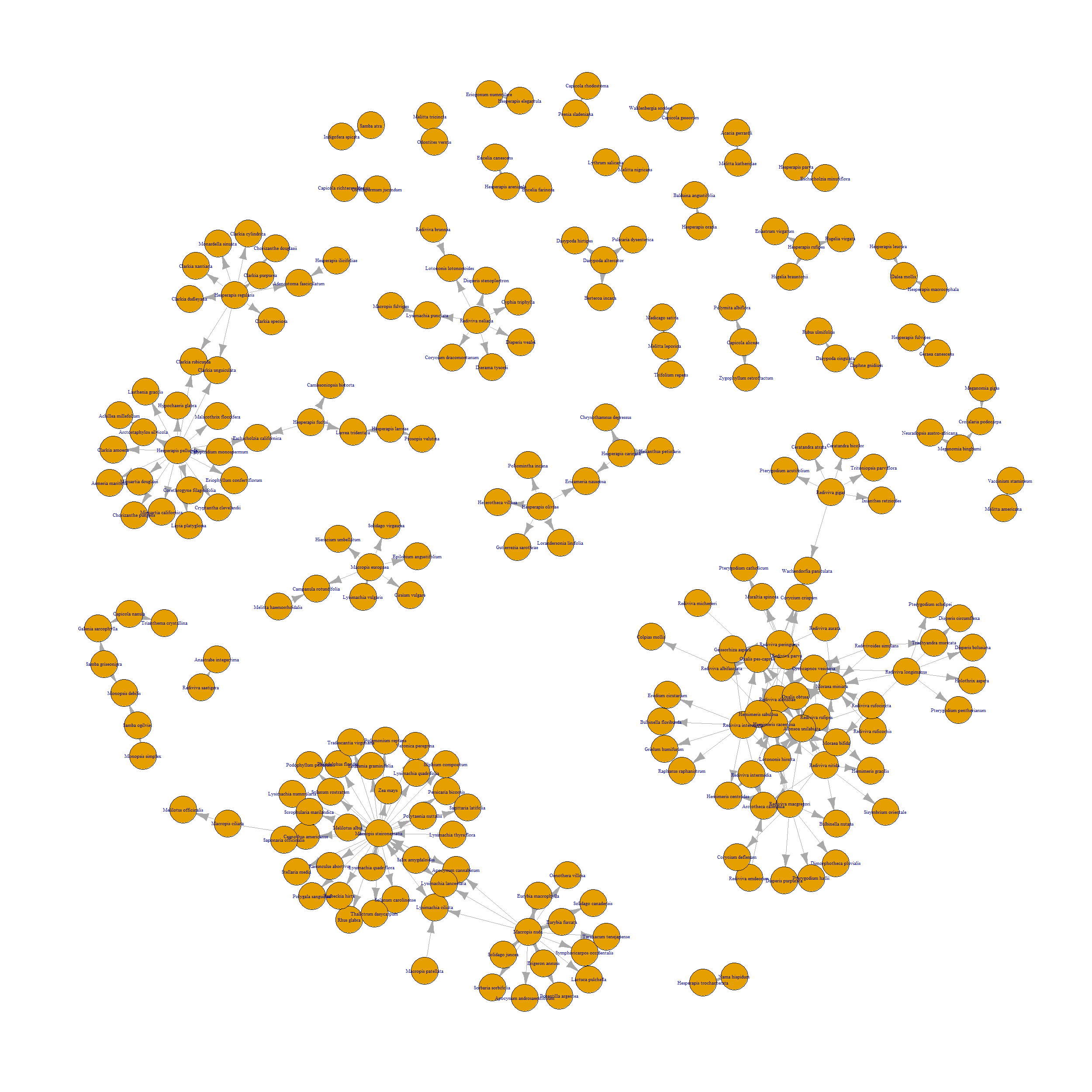
Fig. 13 This is a very preliminary network graph for interactions between species in the Melittidae bee family and all plant species.
Week 4
This week we focused on the specific bee family melittidae to create interaction networks. Our python group had some difficulty with creating the network visualizations. We tried using NetworkX and Plotly but there was a pretty steep learning curve when it came to the syntax involved. One issue we had was that the specific plotly module we were using required numerical values so we would have to assign values to the different melittidae interactions in our data. We were able to get some networks plotted but they were in no way presentable or useful.
In R, we spent time cleaning data in a way that would be useful in coding various visualization methods. In particular, building ways to filter data by various genus, species, and family levels took a good amount of time. To accomplish this, and also to use the information to identify the unique interactions between interesting bees and various types of plants, we utilized the dplyr and tidyr quite a bit. Finally, using these data, we were able to assign occurrence quantities to these interactions, inspiring the use of ggplot and its heat map feature to give us more useful results.
In meeting, we discussed ideas for various filtering methods and their respective uses, and also discussed future possibilities for use of such data.
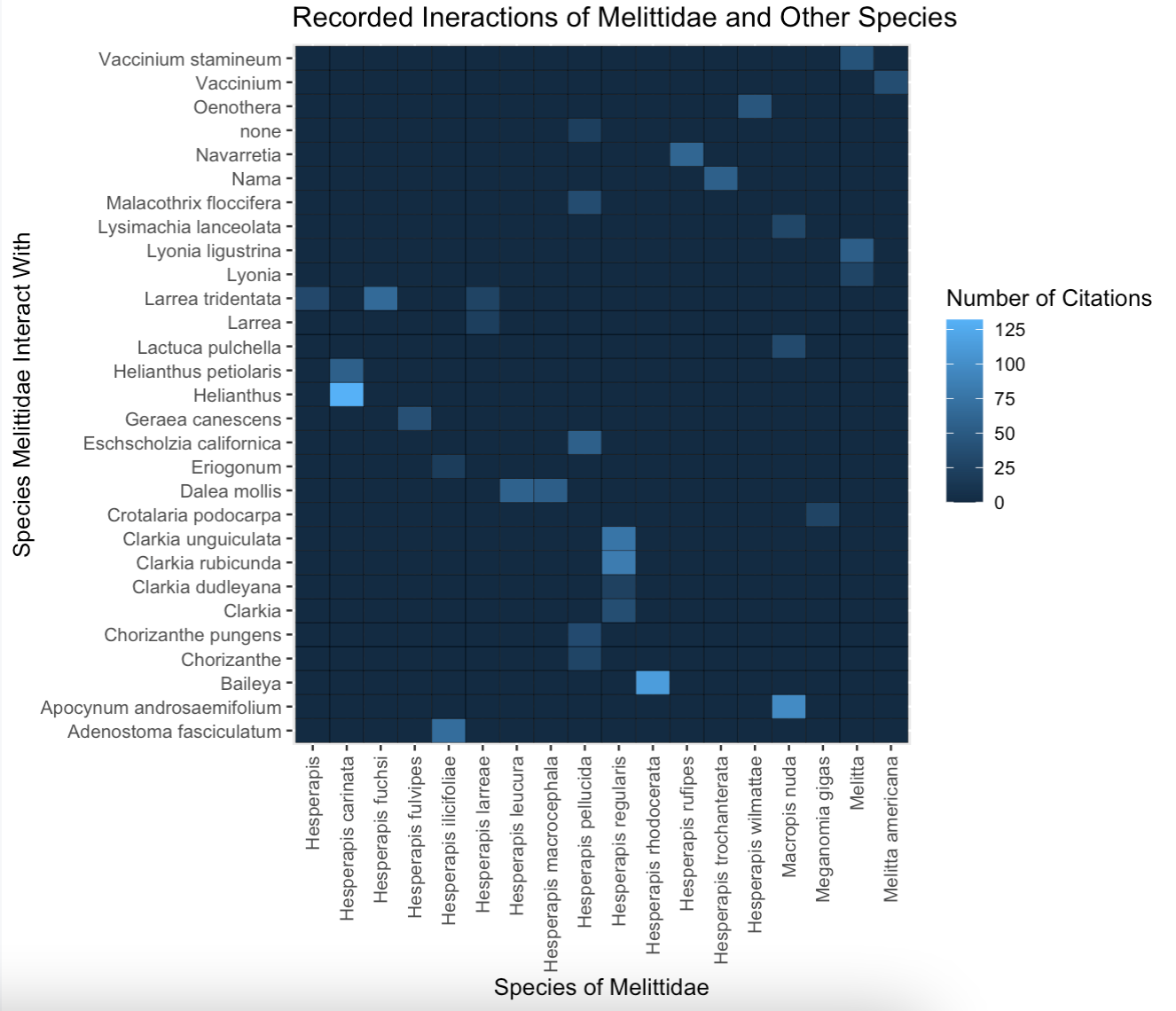
Fig. 14 A preliminary heatmap of the interactions between species in the Melittidae family and all plant species. Some fields in the species name column were blank so the genus was used instead. There seems to be the most interactions between Hesperapis carinata and Helianthus. The citation count is synonymous with interaction count.
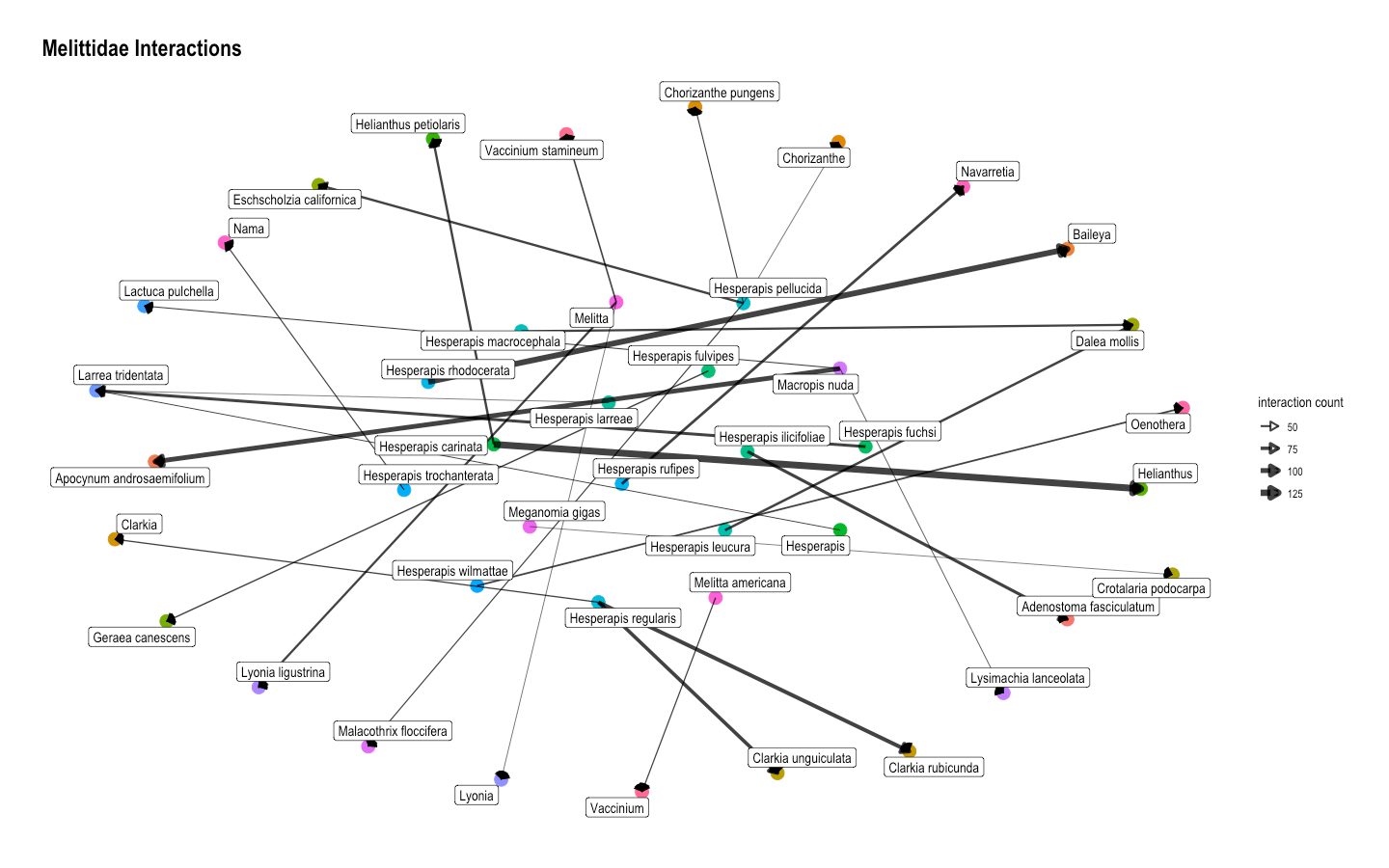
Fig. 15 Another network graph for interactions between species in the Melittidae bee family and all plant species. It also shows that the strongest connection is between Hesperapis carinata and Helianthus.
Conclusion and Next Steps
There are many ways to present the information in a network. Both heatmaps and network graphs have their own pros and cons. For example, the heatmap seems to present information in a neater way whereas the arrows in the network graph can lead someone’s eyes all over the page. However, it is easier to categorize the species into broader categories like genus by color-coding the nodes in network graphs. For our next steps, we plan to refine our visualizations even more and hone in on a more specific goal for our project.