Update 2
Overview
We have been working on taking our progress, results, and findings from update 1 and building our analyses on top of that here in order to keep extracting valuable information regarding our fish and water data. We also had to overcome a few obstacles with respect to matching our two datasets we have (fish and water) to each other so that we can analyze the fish and water datasets together. For example, in order to be able to easily see what the water characteristics were when a certain fish species was very dominant. We have been making more visualizations, more processed datasets , as well as drawing together various correlations in order to start to draw out correlations between the makeup of fish and water characteristics (specifically pH). Finally, we also worked on taking our water dataset, and being able to interpolate what the pH level of the water should be at a given place and time based on the other water characteristics we do have available in the dataset due to great work from a paper that we will write the reference for in the “Accurately Inferring Water pH Values Based On Other Water Characteristics” section.
Reiterating Our Project and Goal
In our project, we aim to correlate water data containing many water characteristics at a given location and time, to our fish data, in order to draw better understand relationships between how water characteristics affect the makeup of specific species in California’s oceans. We are especially interested in seeing how water pH affects the makeup of these fish species. We hope that our conclusions can be used to for one, be able to accurately infer what the makeup of fish looks like at a given time where we know the water makeup, and two also be able to predict what the makeup of fish should look like in the future. We hope that this will help reduce the effort needed to be able to get a portrayal of the makeup of fish, since currently usually sampling the fish by a boat all along California’s oceans is the effort that is needed.
We are have a water time series dataset, what gives information about many water characteristics over many different locations, from 2008-2015, and we also have a fish time series dataset that tells us the abundance of each fish species at a given location and time, from the 1960’s until present.
Making More Processed Datasets
Subsetting the Fish Dataset to Match the Water Dataset Sample Locations/Times
The originial fish dataset had observations dating back to the 1950s and over 100 different locations along the California coast. However, the water dataset only had data avilable from 2008 to 2015. We also discovered that the water dataset covered a much smaller set of locations than the fish dataset. Our goal is to be able to correlate the pH calculated from the water dataset with the abundance of fish species from the fish dataset. In order to follow this goal and provide the most accurate readings, we not only subsetted the fish dataset to match the time frame of available water data, but we also wanted to subset with only the locations that matched those where water data is available.
When graphing the subsetted data, we noticed that there were 6 water locations that did not align in the same line/station pattern as the fish data. After further analysis, we found that all 6 anomalies occured on the same date, November of 2013 (Cruise=201311). We decided to elimate this from the final combined data for intial correlations to be able have the most accurate pH and larval fish abundance correlations as possible.
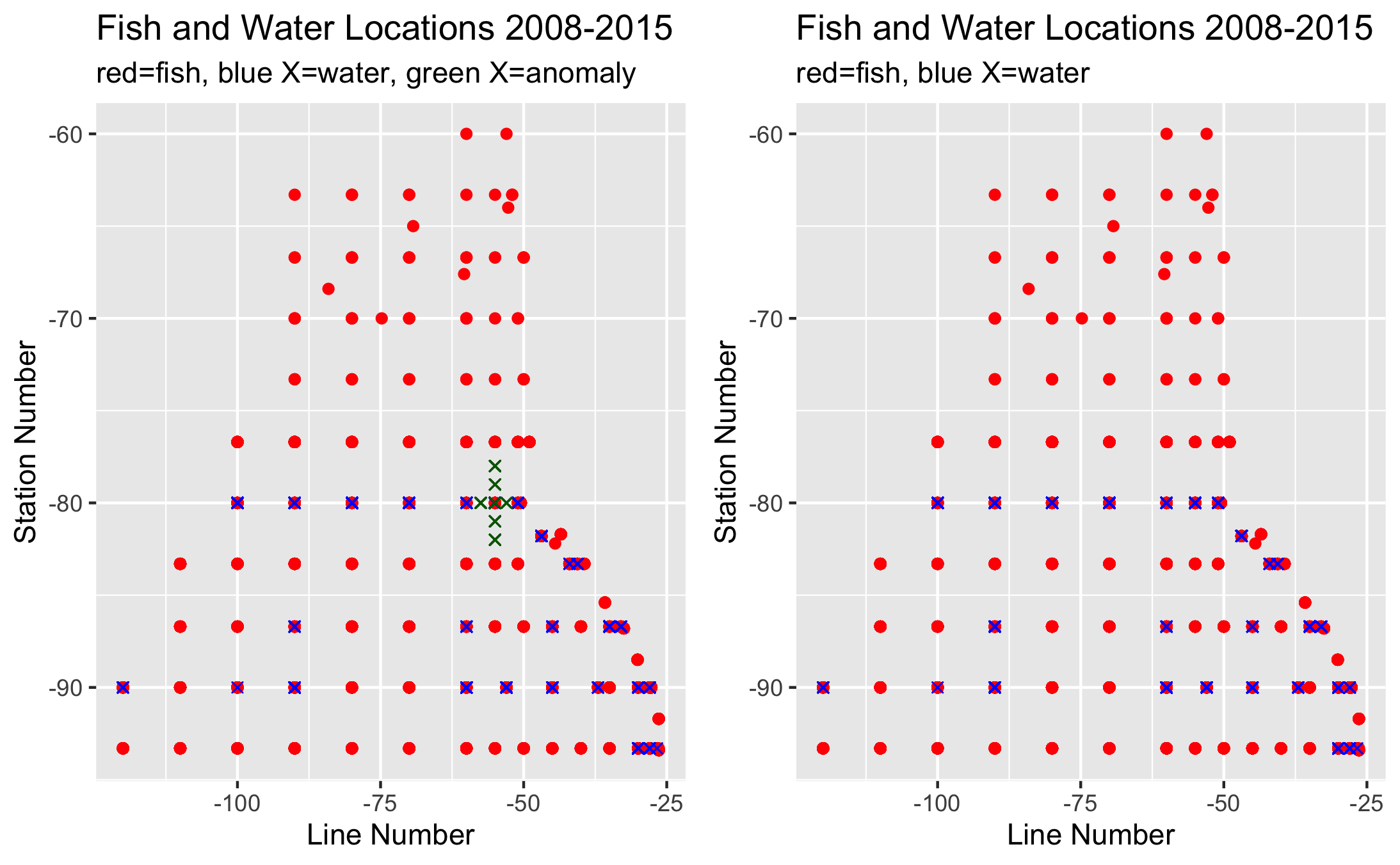
Fig. 2 Plots showing where data is sampled from (blue points are water samples red are fish samples). The left side shows the few water data points (green X’s) that did not match the line and station patterns in the fish dataset.
Grouping and Splitting the Water and Fish Dataset by Location
We made sub-time series datasets, where each of these smaller datasets give the time series of water over all time steps in a certain small location area. We also split the fish data up this way as well in order to analyze the time series at a certain location only.
Finding the Most Abundant Fish Species at a given location at a Given Time (and storing it as a dataset)
In order to be able to correlate the makeup of fish species to water characteristics, we have started by obtaining the three most abundant fish species at a given location and time, and storing these results in a .csv file as a dataset. The fish dataset consists of fish abundance at a given location and time for each species of fish we are looking at, however we needed a way to compare abundance of two species against each other to see which has more abundant. For example at a given time/location, a species with abundance level of 19 when it’s average abundance is 10 is a different abundance level measure than a species with abundance of 19 when its average abundance is 500. So in order to compare this, we made another dataset, that measures the abundance of a species relative to its mean abundance at any given space and time. This way now, we can look at this relative abundances, and pick out the top three at a given time/location to be able to accurately extract “most abundant species”. From here we are now working on drawing out as many correlations and derived statistics as we can relating fish species abundance to water characteriatics.

Fig. 3 The columns of the dataset displaying the three most abundant fish species at a given location and time. “Cruise” denotes the date (YYYYMM); for example “201411” means “November of 2014”, and “Line_Sta_ID” is a way to measure the location in the ocean of a sample.
Water Correlations
With the water data we were able to find strong postive and negative correlation.We used Pearson’s r correlation that measures linear correlation. Using linear regression method and finding pearson’s r coefficient I was able to make these visuals shown below.
For my strong positive correlation I used DIC1 (Dissolve Inorganic Carbon) as the same feature but used different observant such as Sigma-Theta (denisty of water), Salinity1 (Salinity in DIC bottles) and TA1 (total alkanity). From the visual plots I made we can see that when we have low DIC we will most likely find low Sigma-Theta , Salinity1 and TA1 and vice cersa when DIC is high.
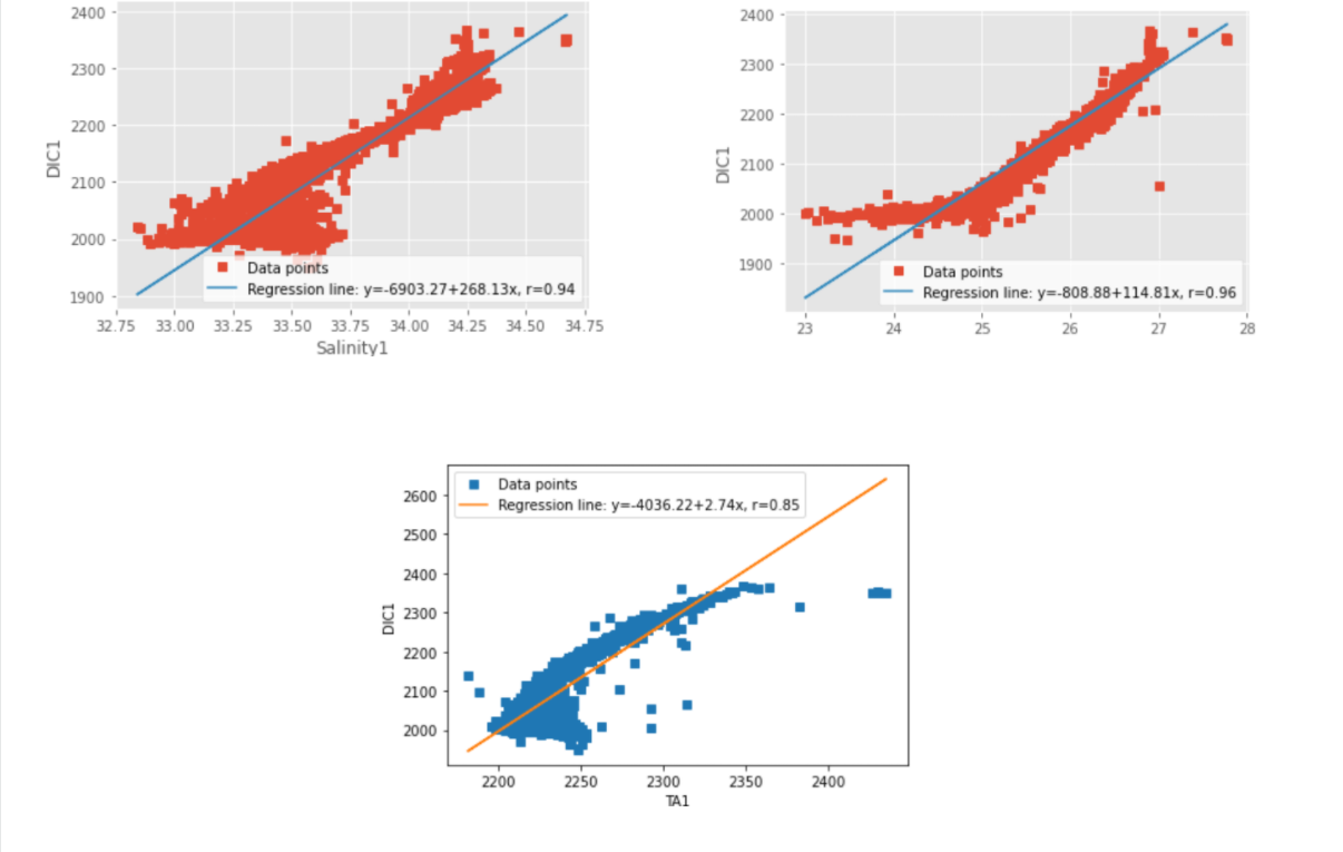
Fig. 4 Positively correlated characteristics (the missing observant on the top right plot is “sigma-theta”)
For my strong negetive correltation I use Tempature as my feature and had Salinity1, and DIC1 as my observant.With the visual plots I generated we can see the strong negative correlation. In area where their are high tempature in our data then we will find low levels of DIC and Salinity since they share a negative correlation relationship and vice versa when tempature is low.
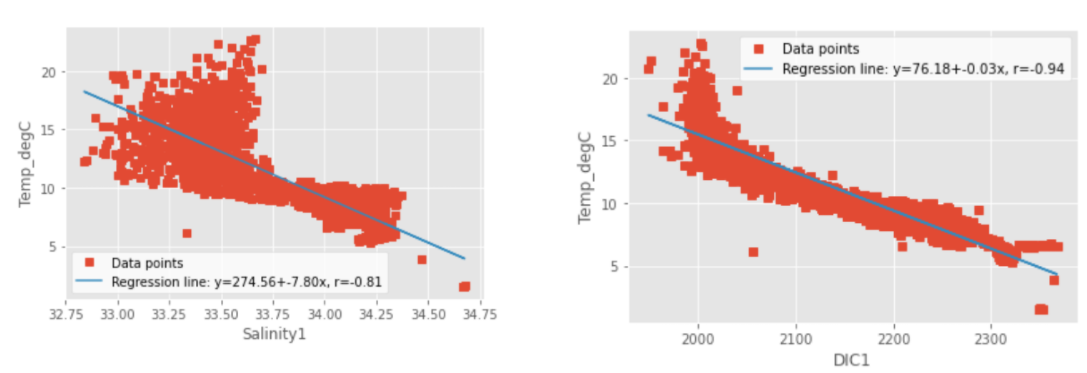
Fig. 5 Negatively correlated characteristics
Heatmaps of Water Characteristics
One of our objectives, we hold important for our goal of being able to find correlations between water characteristics and makeup of fish, is to be able to clearly visualize the levels of a given water characteristic at all present locations, at all given time steps. For example, to be able to view a spatial heatmap of say water TA (Total Alkalinity, which measures the water’s ability to not be affected by an introduction of an acidic compound to the water), where at any given time step, we can spatially visualize the pH levels of the water at all present locations in the dataset by color on a 2D lattitude/longitude graph (red color at a location means high TA, blue color means low TA). We decided on the color theme, of a red color at a graph location indicating higher levels of the observed characteristic and blue color indicating lower level.
However, what does “high” and “low” mean with respect to a given water characteristic? How do we decide on what “high” and “low” should be for a water characteristic. For any given water characteristic, we looked at the range of values it holds overall over all of the time steps (looking at the globally lowest and highest value in the dataset), and base the notion of “high” and “low” for that observed characteristic. At a given location and time step, the closer to the global minimum the characteristic value is, the “lower” and hence more blue it is denoted as, and the closer the the global maximum the value there is, the “higher” and more red it is denoted as. We made sure that for a given characteristic, we keep the same range of values we are color coding by over all time steps, so that this way we can compare how characteristic levels are changing over time visually by looking at how the colors change spatially over time, by looking at all the time step heatmaps for a given characteristic.
Locating the California Coast on the Heatmaps
In the heatmaps, the cities of Santa Barbara and San Diego have been labelled, and the California coast is along that edge on the right hand side of the heatmaps between where the heatmap ends and where the white on the graph starts on the right hand side where San Diego and Santa Barbara are labelled.
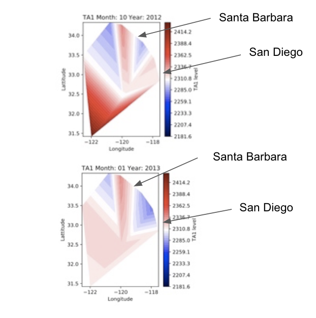
Fig. 6 Two spatial heatmaps for the water alkalinity (TA) characteristic for two timesteps. The color at a location indicates the TA level in the water at that location.
Accurately Inferring Water pH Values Based On Other Water Characteristics
Our dataset containing the water characteristics contains many water characteristics, about water at any avilable location and time in the ocean from 2008-2015 over various depths. However, the dataset does not contain information about the water pH at these times and locations. Therefore, we wanted to find a way to accurately infer the water pH values at the given location/time water samples in our dataset. This way, at any available location/time in the water dataset, we can also be able to look at the water pH level as well. This is very important to us because we strongly suspect that the pH levels play a very significant part in determinint the makeup of the fish population, and in determining which fish species are more abundant where.
Due to the paper Perspectives in Environmental Chemistry by Donald L. Macalady (http://denning.atmos.colostate.edu/ats760/Readings/Tans_1998.pdf), as well as the discussion Simplified Carbonate Chemistry of Seawater based on an article by Pieter Tans, and the website https://biocycle.atmos.colostate.edu/shiny/carbonate/#References, we wrote a Python script using the algorithm from the above mentioned sources that calculates the water pH level, based on using the water DIC (Dissolved Inorganic Carbon), TA (Total Alkalinity), and Temperature.
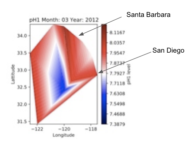
Fig. 7 A sample spatial heatmap for the water pH characteristic levels that display the pH levels over various locations.
Next Steps
We now intend to take our findings so far keep making more correlations between specific species of fish and water pH, as well as other water characteristics. We also in the future plan to accurately predict what the water should have been before 2008 and verify that our correlations are holding.