CALCOLFI Project Update 3
Overview
CALCOFI is an organization tasked with studying the marine environment of coastal California and investigating the relationships between climate, fish population, and other human activities. Our project primarily focuses on two datasets:
Landing - A dataset comprised of multiple fish species and how many of them were caught and sold for various prices over the years.
Larvae - A dataset comprised of multiple fish species and how many of their larvae was collected over the years.
In the beginning, we were using these two datasets with the intention of finding a a relationship, if there are any, between fish larvae and fish being caught. As time passes, our workflow and goal has become more developed, and we have introduced new datasets into our project including:
Bottle & Cast - 2 datasets that work hand in hand with one another that contain records of the environmental conditions where the fish and larvae were found. Cast contains information about the cruise being sent out to collect the water samples, where Bottle contains information regarding the water quality including temperature and salinity.
Goal Update
While our dataset contains information for various fish species, we have decided to hone in on sardines to keep our research concise and focused. CALCOFI was founded due to investigate the decline of sardine populations during the 1950s so it felt fitting to use sardine as our species of interest. We wanted to update our goal and create a story with our data exploring the sardine population and the various environmental, human, and natural factors that may affect it. To aid us in this, we decided to use Plotly Dash, a tool used where we can create a website with all our important findings and interpretations using a Python-only tech stack.
Dash Ideas
We are exploring examples of what we could do utilizing Dash. Here is a Dash app we found that has a similar structure to one that could work for our mission.
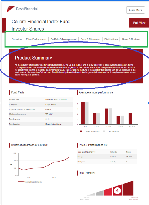
The pros for using this outline is that it has a very easy to follow structure, the format looks very neat, and that there is a source code for reference.
The Green Box would have a different outline similar to:
Overview - Background Data - Data and Importance - Prediction and Interpretation
Overview
This is where the blue circle in the image is referencing to. A general background on CALCOLFI and their mission, as well as our goal with this project. We would generate a story about how CALCOLFI was founded primarily to focus on sardine, and we can relate back to this throughout by focusing on data and manipulations related to sardine.
Background Data
We are planning on making some spatial data sliders that allow the user to scroll through various maps of larval location, catch location, and sea surface temperature. This also allows the audience to visualize the region of interest.
We would also include the impact that region can have on our analysis, including the region’s environmental factors (weather el nino la nina, ocean conditions, etc) and any related analysis.
We could also include some basic exploratory analysis like sardine catch and larvae over time, integrated with an interactive toolkit where the user can adjust the year at will.
Data and Importance
These will be the meat of all our analysis beyond our exploratory work where we had to do some data manipulation like lagged analysis or cross correlation
In addition, each visualization could have a small section explaining what the data means, along with what insight we can take away from it
We thought of a structure where our page would endlessly scroll down so the user can decide the pace of their reading, as well as making some of our plots interactive for the user.
Prediction and Interpretation
These will be if we have any code or programs that can predict things like catch amount, larval amount, or price and conclude the importance of our research
Building the App
In addition to planning, we have just begun to actually build our website using Dash. We are working to convert our code from a matplotlib oriented notebook to a plotly oriented .py file.
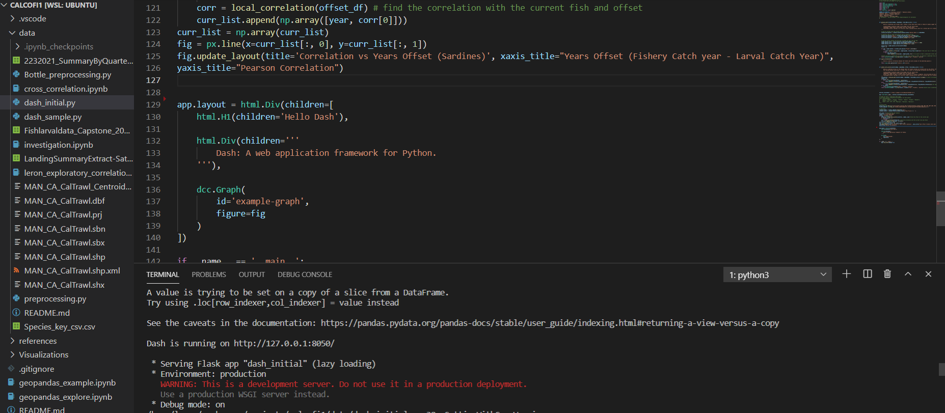
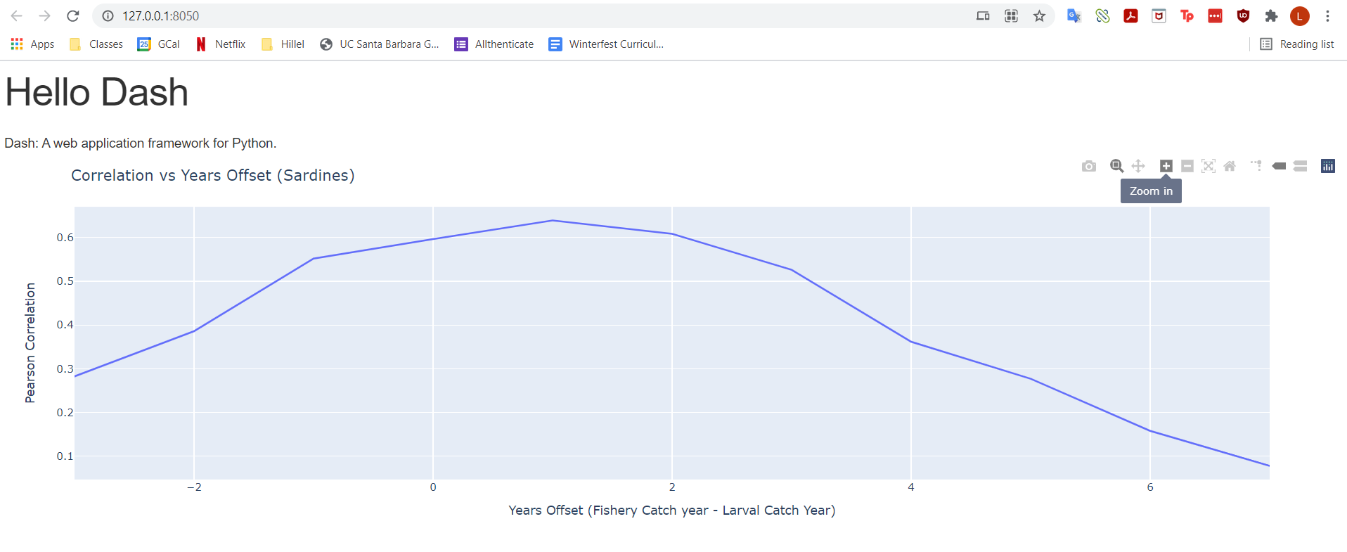
We were able to get the website to display properly after some wrangling, and have the first graph show. For our next steps, we will continue to add our data to the website, as well as investigate if it would be easier to use jupyter dash, which could allow us to run a website from a jupyter notebook rather than converting it to a python file.